
The challenge
English Heritage was evolving its brand to feel more contemporary, inclusive and bold while maintaining its authority and heritage. While core elements such as the logo, typography and colour palette had been defined, there was a gap between brand guidelines and practical digital application for teams such as Social and Content.
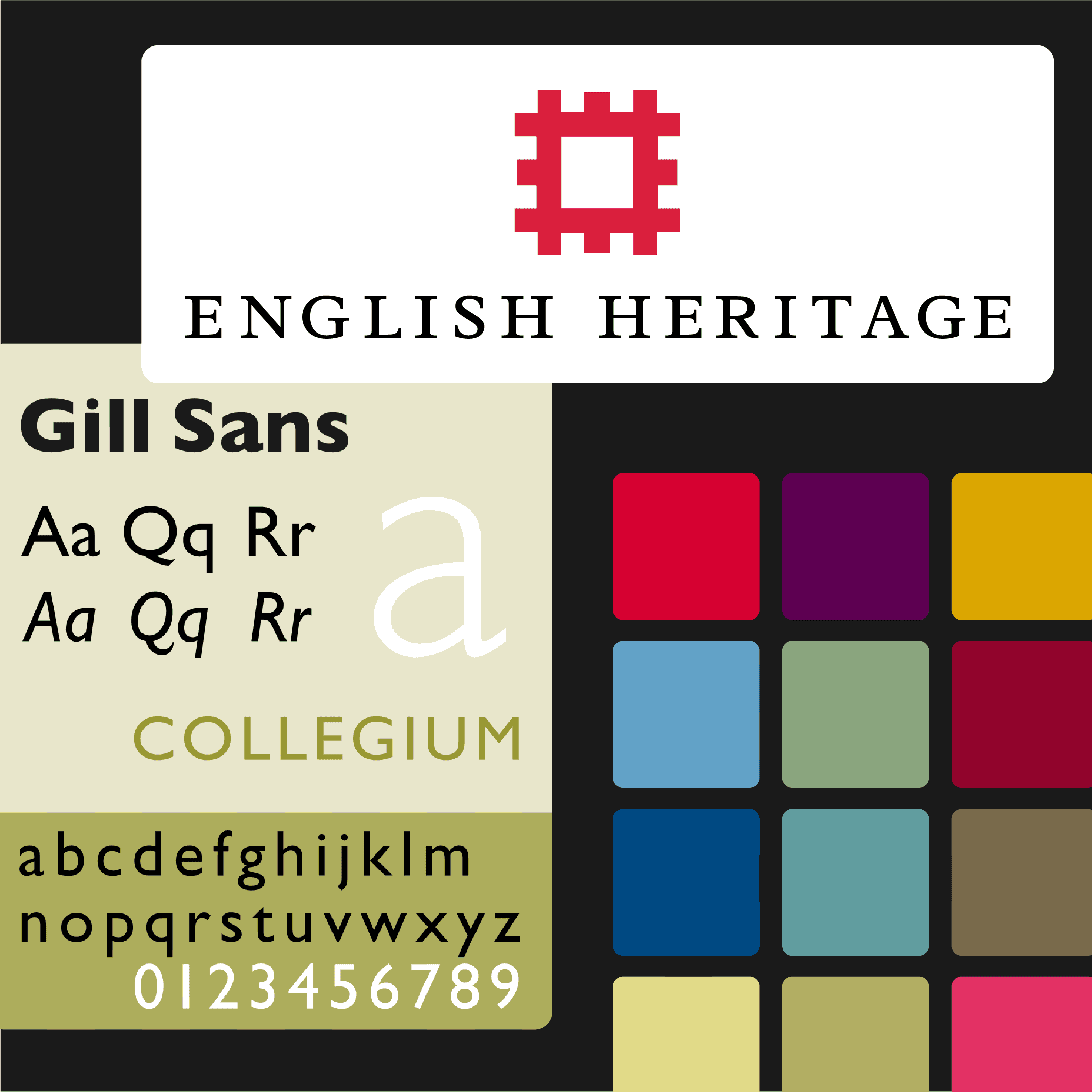
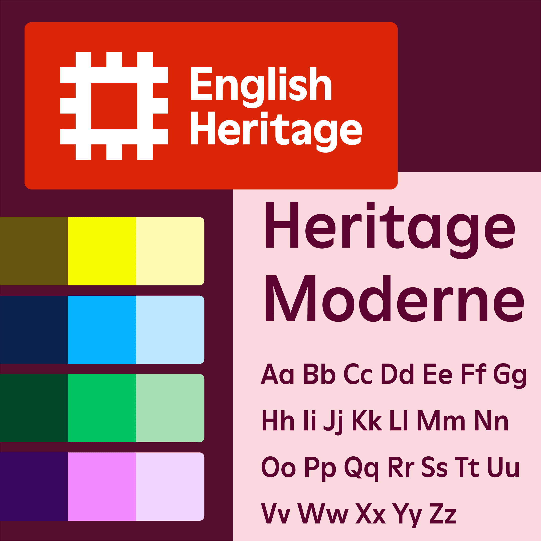
I had supported the initial brand refresh by advocating for a colour palette and core typeface that would enable more accessible design. My challenge was now to apply the freshed brand principles across social and email templates to create a modern, cohesive and accessible visual identity across digital channels.
The process
I began by auditing existing digital communications across social and email channels, identifying inconsistencies and areas for improvement into colour, typography, imagery, layout and accessibility.
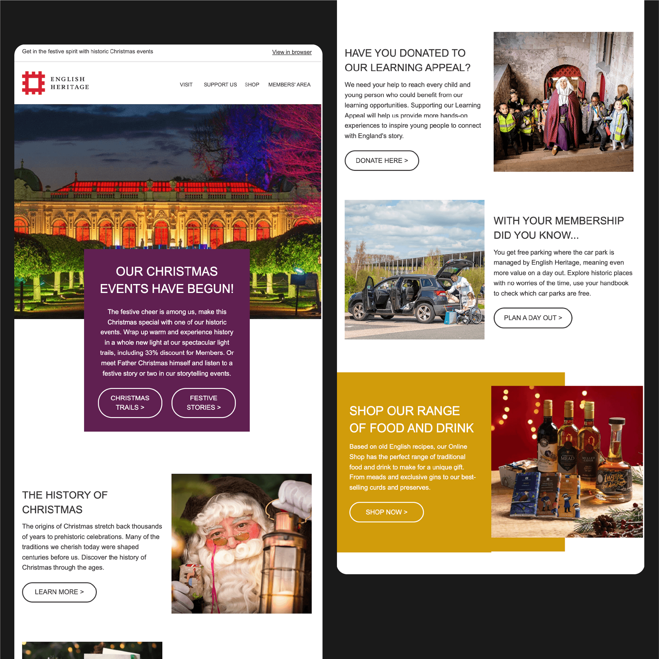
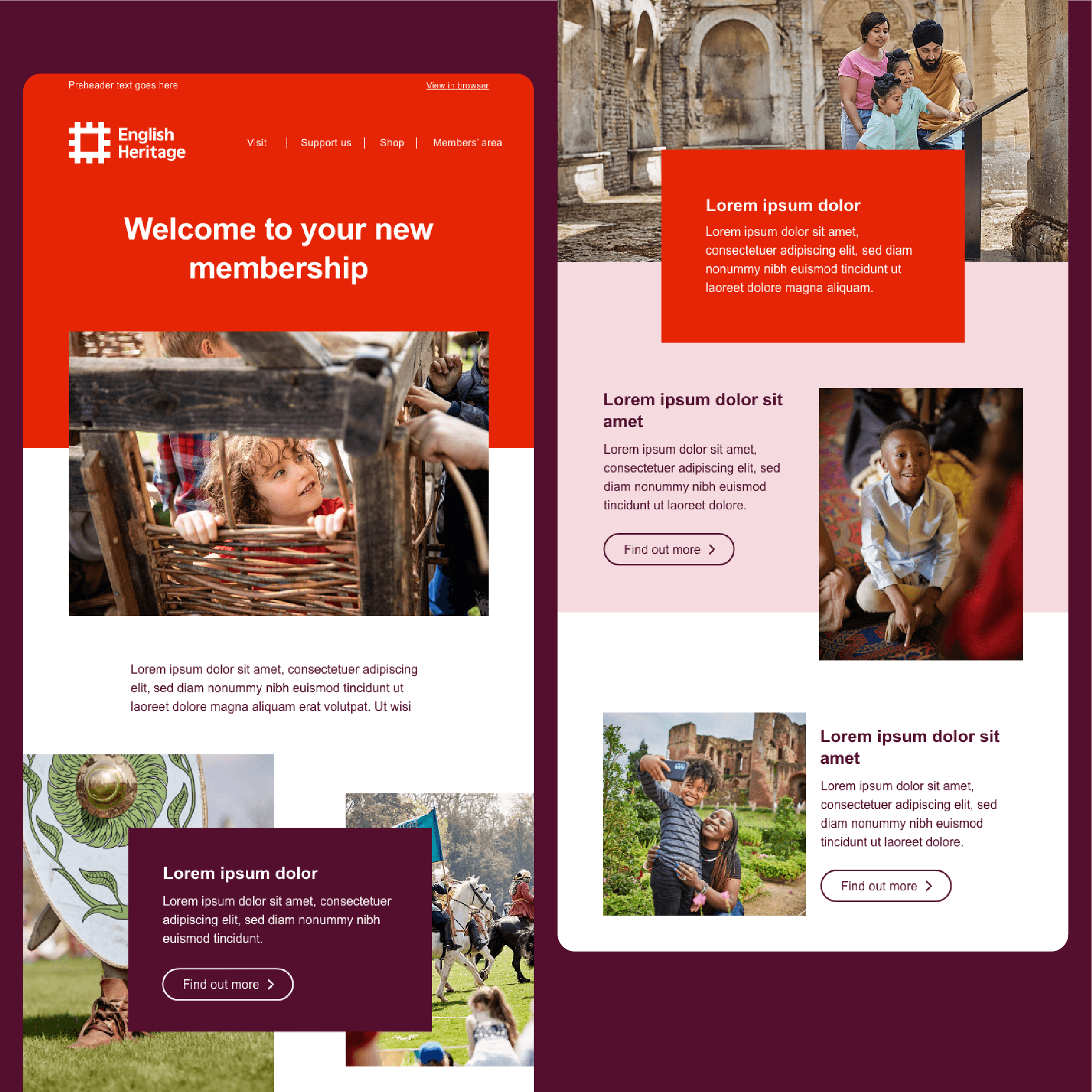
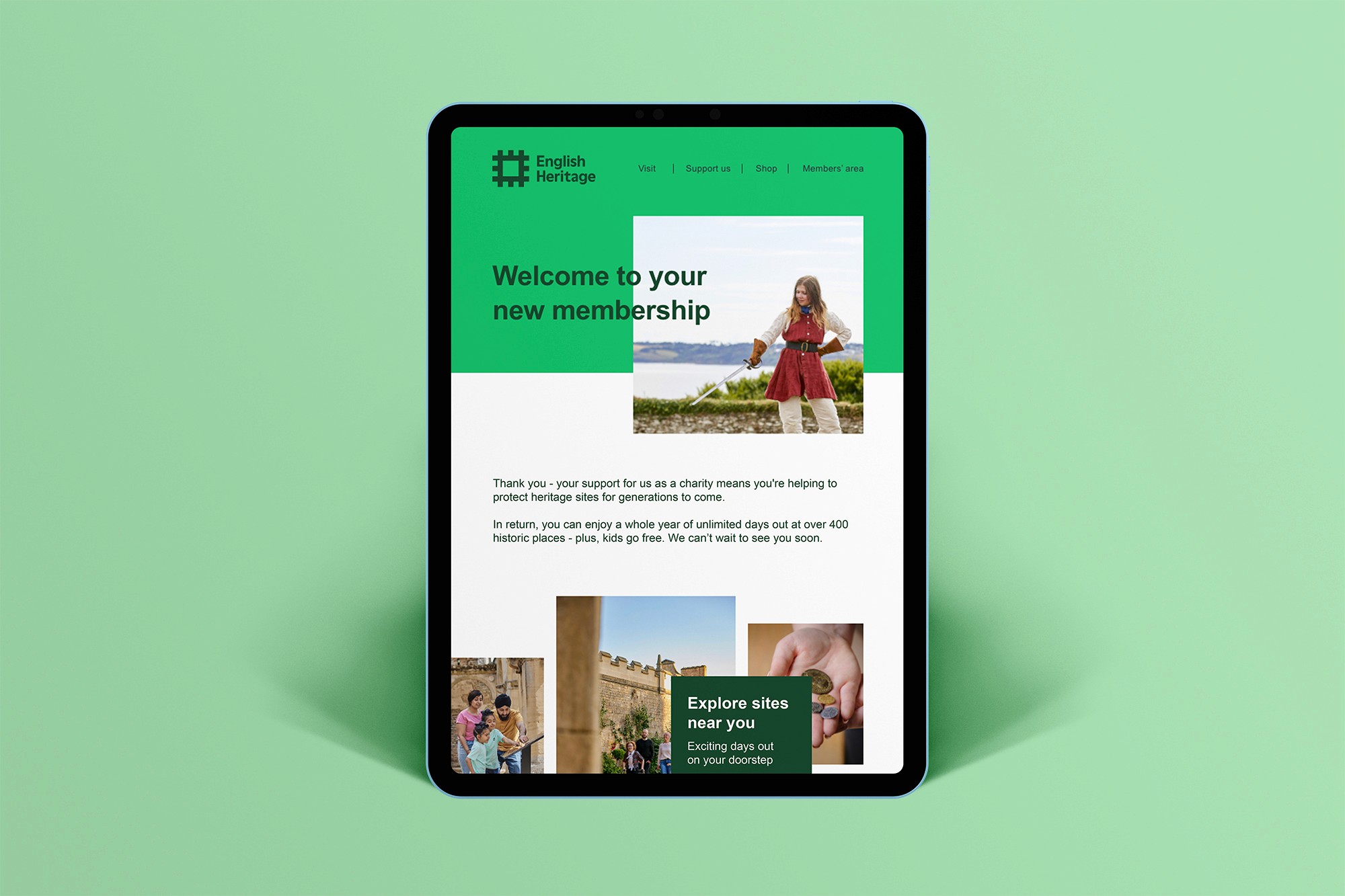
I set up the template files with clear text hierarchy, flexible layouts and defined colour combinations that met WCAG contrast ratios, supporting Social and Content teams in producing accessible designs with ease.

The solution
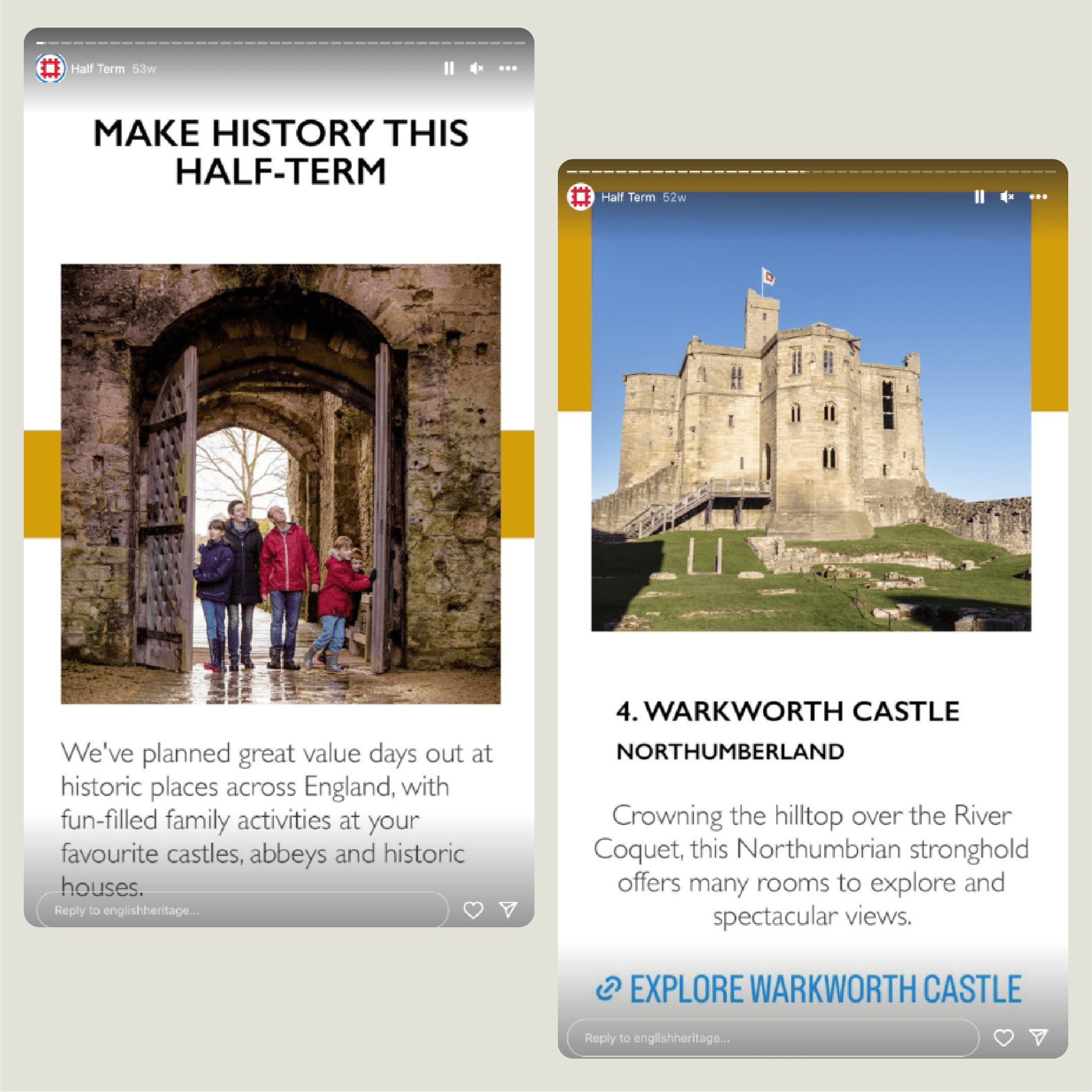
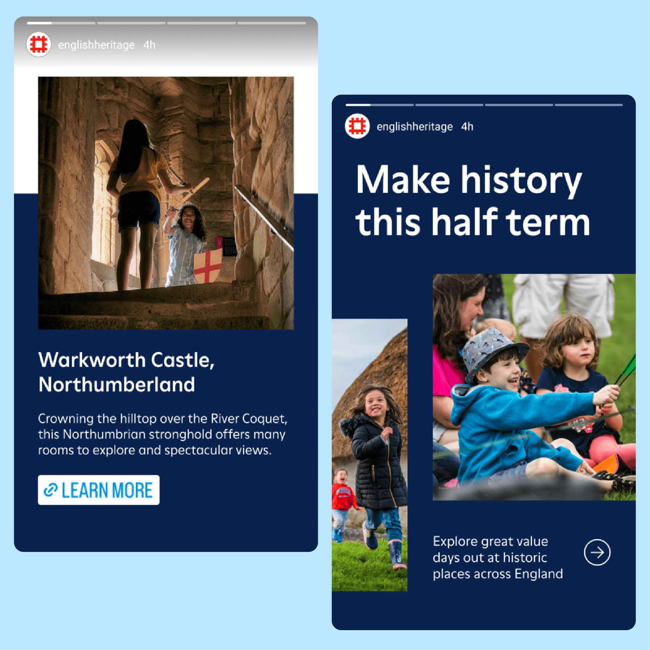
I created a cohesive suite of modular social media templates adaptable across formats (square, portrait, landscape). I balanced English Heritage’s own imagery with modern typography and dynamic layouts, resulting in a fresh, bold and engaging approach that felt like a natural progression from the previous styles.
I refreshed common formats already used by the Social team (such as quizzes, ‘What’s on?’ and ‘Make history this half term’ campaigns) to ensure the team were well-equipped for their specific requirements.
I also developed a flexible email template system built around modular content blocks with clear text hierarchy and strong visual rhythm to ensure content felt engaging rather than dense. As with the social templates, I prioritised colour contrast and established templates for our most-used components such as events and membership messaging.
Results
The refreshed digital toolkit created greater visual consistency across channels and reduced ad-hoc design requests by giving internal teams easy-to-use templates. The work strengthened English Heritage’s brand presence, helping portray a more confident, cohesive and contemporary organisation.

Reflections
When designing these templates I considered the users who would be interacting with English Heritage content, as well as the internal team members who would be using the templates to produce that content.
To ensure the templates improved internal teams' workflows, I made sure to strike a balance between dynamic design and user-friendly templates, so that teams without strong familiarity with design principles would be able to produce high-quality on-brand content independently.
© Keeley Seymour